Designing Slatework: A Recruiting SaaS Website Template
How the Slatework template sells recruiting software with a live drag-and-drop hiring pipeline, a weighted scorecard and a crisp, corporate look.

By Paul Peery
· 7 min read
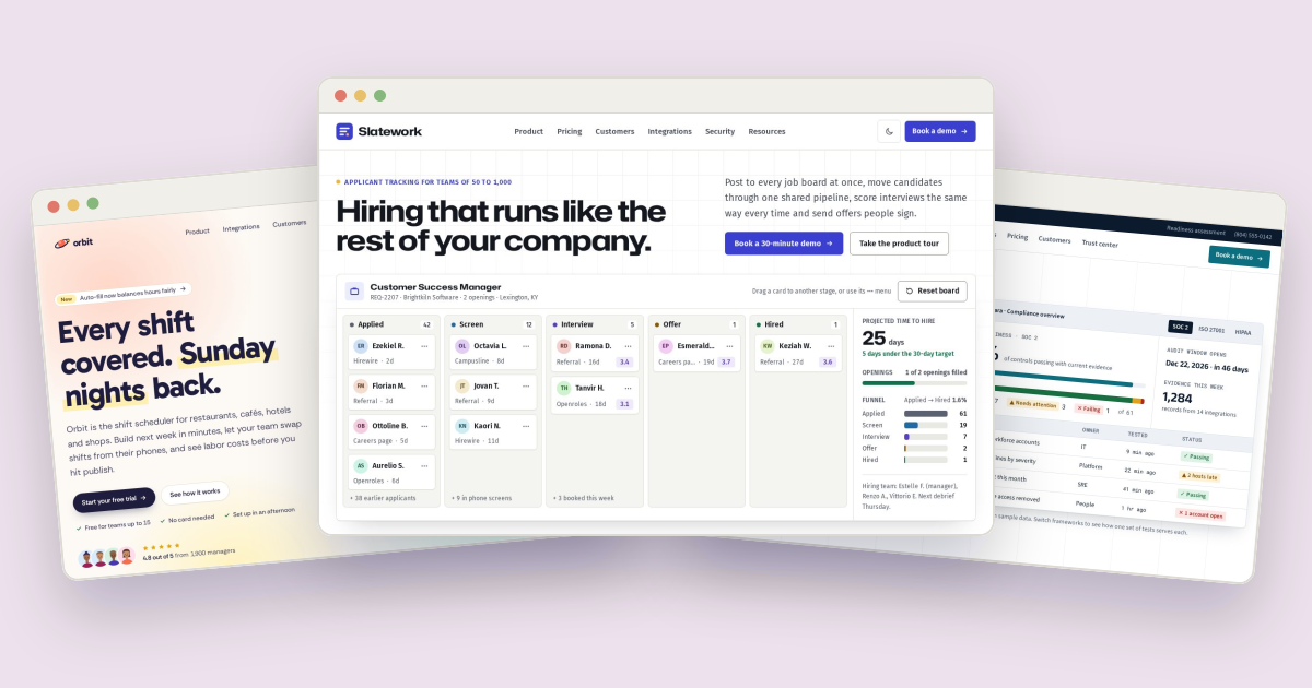
Slatework is a website template for recruiting software: an applicant tracking system (ATS) sold to companies with 50 to 1,000 employees. People who buy that kind of software are HR leads and recruiters who have sat through plenty of demos, and they want to see the product work before they book another one. So Slatework puts a working hiring pipeline at the top of the home page, where visitors drag candidates from Applied to Hired and watch the numbers change, and wraps it in a crisp, corporate design that looks like software a finance team would approve. This post walks through how it's built and how to adapt it.
The demo company is Slatework, Inc., a fictional software company in Lexington, Kentucky. Its customers, integrations, interviewers and candidates are all made up, and the customer and integration marks are original drawings, not real logos.
Two fonts, one stretched#
Every page loads two Google Fonts families in one <link>:
href="https://fonts.googleapis.com/css2?family=Fira+Sans:ital,wght@0,400;0,500;0,600;1,400&family=Hubot+Sans:wdth,wght@100..125,500..800&display=swap"Hubot Sans sets the headings. It's a variable font with a width axis, and Slatework loads the range from 100 to 125 so it can set every heading a little wider than normal:
h1, h2, h3, h4 { @apply font-display; font-stretch: 112%; }A slightly extended sans reads as engineered and confident, which suits a product that promises structure. Fira Sans handles body text, labels and the dense parts of the interface, where it stays legible at small sizes.
The body turns on tabular figures (font-variant-numeric: tabular-nums) so counts, prices and scores line up in columns and don't jiggle when they change. Headings switch that off again, with a comment in src/input.css explaining why: Hubot Sans draws a slashed zero with tabular figures, which looks odd in a headline.
White paper, indigo and a marigold dot#
The palette is built as CSS variables, with a light theme in :root and a dark one in .dark, then mapped to Tailwind names in an @theme inline block. That's what lets a class like bg-brand or text-ink-soft follow the theme without a single dark: prefix in the markup:
:root {
  --paper: #ffffff;        /* page background, cards */
  --canvas: #f4f4f1;       /* alternate bands, board columns */
  --line: #dddfd7;         /* hairlines and card borders */
  --ink: #15171e;          /* headings and body */
  --brand: #3a3fd0;        /* Slatework indigo: buttons, links, focus */
}
@theme inline {
  --color-paper: var(--paper);
  --color-brand: var(--brand);
}
Deep indigo marks everything you can click. A marigold yellow, #f2b33d, is used sparingly: the small dot in front of the home page eyebrow, one bar in a feature icon, the primary button on the dark call-to-action band. Because it stays the same in both themes, it sits in the regular @theme block next to the "night" colors used by the footer and call-to-action bands.
The five pipeline stages each get their own color, from slate gray for Applied through blue, violet and amber to green for Hired, with a soft tint for chips. The source notes that each stage color passes WCAG AA as text on white, and the dark theme redefines all of them in lighter shades.
The dark theme is applied by a one-line script in each page's <head> before the page paints. It reads a saved choice (slatework:theme) or falls back to the visitor's system setting, so there's no white flash for someone who prefers dark mode.
Hairline grids and quiet surfaces#
The hero sits on a faint 48px grid drawn with two CSS gradients and faded out toward the bottom with a mask:
.gridlines { background-image: linear-gradient(var(--line) 1px, transparent 1px), linear-gradient(90deg, var(--line) 1px, transparent 1px); background-size: 48px 48px; }<div class="gridlines pointer-events-none absolute inset-0 opacity-50 [mask-image:linear-gradient(to_bottom,black,transparent_70%)]" aria-hidden="true"></div>The grid uses the --line token, so it dims automatically in dark mode. Cards are plain .panels, a 1px hairline border on white with small radii, and only the hero board gets a soft, long shadow (.panel-lift) to lift it off the page. Everything else stays flat. The current page in the navigation is marked by a 3px indigo bar that lines up with the bottom of the header, drawn with a ::after element.
The hiring pipeline in the hero#
The board shows one job opening, "REQ-2207," with two openings, and five columns: Applied, Screen, Interview, Offer and Hired. Visitors can drag a candidate card to another column, and the side panel updates live: stage counts, a funnel, how many openings are filled and the projected time to hire against a 30-day target.
Dragging uses pointer events, so one code path covers mouse, pen and touch. With a mouse, you can grab a card anywhere. On a touch screen, you drag by the card's initials, so swiping across the board still scrolls it:
if (e.pointerType === 'touch' && !e.target.closest('[data-grip]')) return;A drag only starts after the pointer moves 6 pixels, so a click isn't mistaken for a drag. Then a cloned "ghost" card follows the pointer, the original fades, and the column under the pointer is highlighted. On narrow screens, the board scrolls sideways when you drag near its edge. Escape cancels.
Dragging isn't the only way in. Every card has a "Move" button that opens a menu of stages with full arrow-key, Home, End and Escape support. Choosing a stage moves the card, puts focus back on it and announces the result in a live region, for example that a column now has two candidates and the projected time to hire is 23 days.
The numbers come from data.js. Each column count is a number of candidates not shown as cards (STAGE_BASE) plus the cards in it. The funnel counts everyone who reached a stage or a later one, walking the stages backward:
var reached = {}, running = 0;
for (var i = STAGE_IDS.length - 1; i >= 0; i--) { running += counts[STAGE_IDS[i]]; reached[STAGE_IDS[i]] = running; }
With the starting data that's 61 applied and 1 hired, a 1.6% conversion. Time to hire averages each Offer and Hired candidate's days since applying plus the days their stage usually has left. The board remembers moves in localStorage (slatework:pipeline), validates them when it reads them back, and a "Reset board" button restores the starting pipeline.
A scorecard that shows its math#
The interview scorecard appears on the home page and the product tour. It lists five competencies, each with a weight and 1-to-4 rating buttons built as a radio group. The score is a weighted average, and thresholds turn it into a recommendation:
var RECOMMENDATIONS = [
  { min: 3.5, label: 'Strong hire', tone: 'hired' },
  { min: 2.75, label: 'Hire', tone: 'screen' },
  { min: 2, label: 'No hire', tone: 'offer' },
  { min: 0, label: 'Strong no hire', tone: 'danger' }
];
The default ratings give 3.25, Hire. Raise Product knowledge from 2 to 4 and it becomes 3.55, Strong hire. The recommendation chip reuses the stage tones, so green always means a good outcome across the site.
The rest of the product tour#
The product page adds three more small working tools:
- A job board picker that totals the 30-day cost and typical applicants of the boards you tick, next to a live preview of the posting, which flags a pay range whose maximum is below its minimum.
- A panel scheduler that finds times when every chosen interviewer is free in their own time zone, across Eastern, Central, Mountain and Pacific, over the next five weekdays, and shows the slots in the visitor's zone.
- An offer pay band check with a salary slider that shows who has to approve the offer depending on whether it falls inside, below or above the band.
Pricing is per employee, with a monthly and yearly switch and a calculator for the monthly cost, yearly cost and cost per hire, which keeps its inputs in the URL so an estimate can be shared. Customer stories filter by industry and company size, and the integrations directory has search, category counts and a native <dialog> for each integration.
A demo that doesn't go stale#
Nothing a visitor reads as "upcoming" is hard-coded. Interview slots are the next five weekdays after today in Eastern time, webinars fall on the second Thursday of each month, the demo form proposes the next weekday meeting time, and the security page's data retention example counts forward from today. Busy blocks in the scheduler are stored as business day numbers, not dates, so the demo never runs out of calendar. Articles keep their fixed past dates, as real articles would.
Making it your own#
- Change the brand color by editing
--brand,--brand-strong,--brand-softand--brand-linein both:rootand.darkinsrc/input.css, then rebuild the CSS withnpm run build. The logo, favicon and social image use#3a3fd0directly, so change those too. - Rename the stages or candidates in
STAGES,STAGE_BASEandCANDIDATESinassets/js/data.js. The board, funnel and Move menu are all generated from them; keep the Move menu if you redesign the board, since it's the keyboard and screen reader path. - Set your own scorecard with the
COMPETENCIESweights and theRECOMMENDATIONSthresholds. - Set your prices in
PLANS,ANNUAL_DISCOUNTandMIN_EMPLOYEES. - Connect the forms to a form service. The demo request and webinar registration validate in the browser but send nothing; the forms guide and the template's
DOCS.mdshow where to add the request.
The Tailwind CSS guide covers rebuilding the CSS after adding classes. Slatework is also available for Next.js, Astro, Nuxt and WordPress. If it's not the right fit, the SaaS and startup templates include Orbit, a bright shift-scheduling app with its own drag-and-drop demo, and Wardline, a calm compliance product site whose design story is in an earlier post.

About the author
Paul Peery
Founder of Freeframe
Paul Peery runs Freeframe, which publishes complete multi-page website templates in HTML, Next.js, Astro and WordPress, and writes about getting small websites built, launched and kept up to date.