Designing Sidecar: A Product Studio Agency Template
How the Sidecar agency template turns a build log into a website, from graph-paper backgrounds and masking tape to a live engagement estimator.

By Paul Peery
· 7 min read
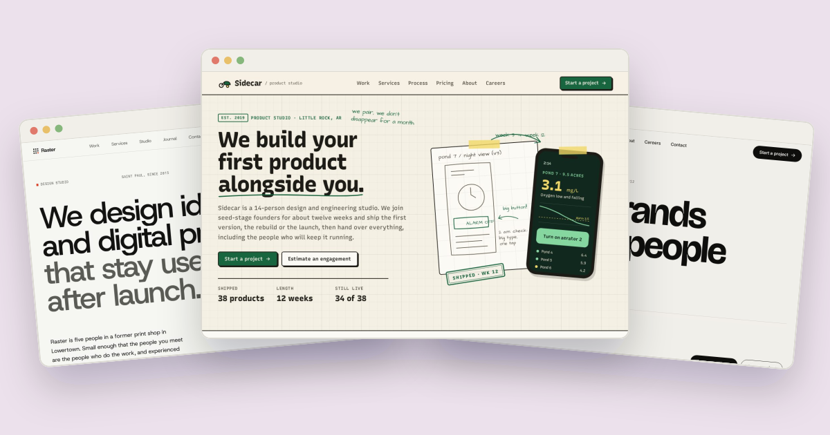
Sidecar is a website template for a product studio: the kind of agency a seed-stage startup hires to design, build and launch its first product. Founders shopping for a studio want to know three things fast. Have you shipped real things? How do you work week to week? What will it cost? So Sidecar looks like a workshop build log, with graph paper, masking tape, stamps and pen notes in the margin, and answers the cost question with a working estimator instead of "contact us for pricing." This post walks through how it's built and how to adapt it.
The demo studio is Sidecar, a fictional 14-person product design and engineering studio on South Main Street in Little Rock, Arkansas. Its clients, founders and team are all made up, and the client marks are original drawings, not real logos.
One variable font doing three jobs#
Every page loads two Google Fonts families in a single <link>:
href="https://fonts.googleapis.com/css2?family=Architects+Daughter&family=Recursive:wght,CASL,MONO@400..800,0..1,0..1&display=swap"Recursive is a variable font with two unusual axes: MONO, which turns it monospaced, and CASL, which gives it a slightly brushy, casual style. Sidecar uses one family for body text, headings and code-style labels by switching those axes with two small Tailwind utilities in src/input.css:
@utility mono {
  font-variation-settings: "MONO" 1, "CASL" 0;
  letter-spacing: 0;
}
@utility casual {
  font-variation-settings: "MONO" 0, "CASL" 0.5;
}
Body text sets both axes to 0. Headings get a touch of the casual axis ("CASL" 0.35), so they feel hand-built without turning playful. Labels, chips, filter buttons and numbers use mono, which reads like a commit log or a spec sheet. The wordmark uses casual. One font file covers all three voices, so the page loads one family where three would otherwise be needed.
Architects Daughter is the second family, used only for margin notes in pen: "we pair, we don't disappear for a month" beside the home page headline, or "working software from week 6, on your phone" under the process ruler. These notes are rotated a few degrees and set in the accent green, like someone annotating a printout.
Paper, ink and one green#
All the colors are tokens in the @theme block, so Tailwind generates bg-paper, text-pine and border-ink from them. The palette is short on purpose:
--color-paper: #f5f0e4;      /* page background */
--color-card: #fcfaf4;       /* sheets and cards */
--color-ink: #1d1b16;        /* text, outlines, hard shadows */
--color-pine: #17663f;       /* Sidecar green: buttons, links, pen notes, focus */
--color-sprout: #86d6a0;     /* light green fills with ink text */
--color-tape: #f1d867;       /* masking tape and highlighter */
Warm paper instead of white, near-black ink instead of pure black, and a single accent, "Sidecar green," for everything clickable. The yellow is reserved for physical things: masking tape, the highlighter behind key words, and text selection (::selection uses the tape color). The comments in the source note which text colors pass WCAG AA on paper, so the softer grays can be used without guessing.
Graph paper, tape and hard shadows#
The background of many sections is engineering paper, drawn with nothing but CSS gradients: a fine 24px grid with a stronger line every fifth square.
.grid-paper {
  background-image:
    linear-gradient(rgb(29 27 22 / .075) 1px, transparent 1px),
    linear-gradient(90deg, rgb(29 27 22 / .075) 1px, transparent 1px),
    linear-gradient(rgb(29 27 22 / .035) 1px, transparent 1px),
    linear-gradient(90deg, rgb(29 27 22 / .035) 1px, transparent 1px);
  background-size: 120px 120px, 120px 120px, 24px 24px, 24px 24px;
}
Cards are "sheets": a 2px ink outline on the card color, with an optional hard offset shadow (shadow-[5px_5px_0_var(--color-ink)]) instead of a soft blur. Buttons use the same idea, and they press in when clicked, moving 2px toward the shadow while the shadow shrinks:
.btn-primary { @apply btn bg-pine text-paper shadow-[3px_3px_0_var(--color-ink)] hover:bg-pine-deep active:translate-x-[2px] active:translate-y-[2px] active:shadow-[1px_1px_0_var(--color-ink)]; }The tape is a plain <span class="tape">, a semi-transparent yellow strip positioned across the top of a card and rotated a degree or three. Each strip gets its own angle in the markup (-rotate-3, rotate-2, rotate-1), so a row of taped cards never looks stamped out. Stamped labels like "Est. 2019" are a .stamp: mono type, uppercase, with a 2px border in the current text color.
Even the current page in the navigation is marked with a short strip of highlighter under the link, drawn with a ::after element in the tape color. On the home page headline, a hand-drawn green underline draws itself in with a stroke-dashoffset animation, only when the visitor hasn't asked for reduced motion.
Sketch to shipped#
The case study page has the template's signature interaction: a slider that compares a week 3 pencil sketch of an app screen with the screen that shipped. Both are inline SVGs stacked on top of each other. A native range input clips the top layer:
function set() {
  var v = +range.value;
  top.style.clipPath = 'inset(0 ' + (100 - v) + '% 0 0)';
  line.style.left = v + '%';
  range.setAttribute('aria-valuetext', v + '% sketch');
}
Because it's a real <input type="range">, it works with arrow keys and screen readers for free, and aria-valuetext announces "50% sketch" rather than a bare number. The sketch even has its own faint grid, so it looks like it was drawn on the same paper as the rest of the site.
The rest of the artwork is drawn too: eight project illustrations in assets/img/work/, client wordmarks, a workbench, the studio front and a 404 page showing a feature "cut from v1." The 14 team portraits are generated in JavaScript by drawAvatar() from a few settings per person in data.js (skin tone, one of six hair styles, hair color, glasses and a background), which keeps the team page consistent and makes adding a person a one-line change.
An estimator instead of "contact us"#
Pricing is where most agency sites go vague. Sidecar's pricing page has an engagement estimator: pick services (design, engineering, launch), a team size from two to six, a number of weeks from 4 to 24, and a fixed sprint or a monthly retainer. The math lives in computeEstimate() and every number comes from data.js:
- The rate is the average per-person-week rate of the services picked ($4,500 for design, $5,000 for engineering, $4,000 for launch in the demo).
- A fixed sprint totals rate × people × weeks and shows a range from 0.9 to 1.15 times that, rounded to $1,000.
- A retainer is billed every four weeks at 10% below the sprint rate, for at least three months.
With the defaults (design and engineering, three people, 12 weeks, fixed sprint), the estimate reads $154,000 to $197,000. A sample timeline shares the weeks among the phases that apply, by weight, so the default plan reads discovery in weeks 1–2, design in 3–5, build in 6–11 and handoff in week 12. A yellow note says it's an estimate, not a quote.
The settings are saved in the browser and written to the URL, so an estimate can be shared with a cofounder. "Send this with a project brief" opens the five-step brief on the contact page with the services ticked and the matching budget range already picked. The services page adds a three-question helper that suggests a fixed sprint, a retainer or a "build to hire" engagement, and links into the estimator with that model selected.
A demo that never goes stale#
An agency site that says "next opening: March 2025" looks abandoned. Sidecar works out its next open start dates from today, in Central time, using a rule in data.js:
START_RULE: { leadDays: 21, everyWeeks: 4, count: 3, closed: { from: [12, 19], to: [1, 3] }, openings: [1, 2, 2] },That's the first Monday at least 21 days out, then every four weeks, skipping a winter break from December 19 to January 3. The same dates feed the home page, the work page, the estimator's timeline and the start date choices in the brief. The team page has a live clock that says whether the Little Rock studio is open right now, and the copyright year fills itself in.
Making it your own#
- Change the accent by editing
--color-pineand--color-pine-deepinsrc/input.cssand rebuilding the CSS withnpm run build. A few drawings use the green as a hex value, so search the HTML andassets/img/for#17663fif you change the palette completely. - Set your prices in
SERVICESandESTIMATEindata.js: the rates, team sizes, week range and the sprint and retainer multipliers. Keep the "estimate, not a quote" note. - Add a project by adding an object to
CASESand a 640×420 drawing or screenshot atassets/img/work/<id>.svg. The work page filters it by service and funding stage automatically. - Match your calendar by editing
START_RULE, or replacestartDates()with a fixed list of dates. - Connect the brief to a form service. The demo sends nothing; the forms guide and the template's
DOCS.mdshow how to post it to a service like Formspree and show the success panel only when the service answers OK. - Swap the fonts by changing the
<link>and the two--font-*tokens. If the new sans has noMONOaxis, point themonoutility at a monospaced family instead.
The customizing guide covers rebuilding the Tailwind CSS. Sidecar is also available for Next.js, Astro, Nuxt and WordPress. If it's not the right fit, the agency and studio templates include Studio, a minimal Swiss-style studio, and Agency, a bold, high-end agency site.

About the author
Paul Peery
Founder of Freeframe
Paul Peery runs Freeframe, which publishes complete multi-page website templates in HTML, Next.js, Astro and WordPress, and writes about getting small websites built, launched and kept up to date.