Freeframe
App9 pages · 4 downloads · Free

Pocket

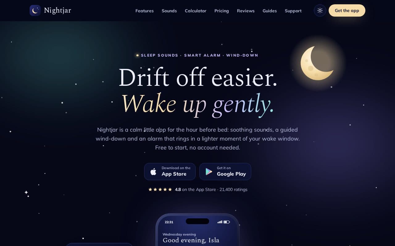
A bright launch site for a mobile app, with phone mockups and a scroll-driven feature tour.

Stack
v1.0.3 changelog

About this template

A complete website for a mobile app: a hero with layered phone mockups built in HTML, a sticky feature tour that swaps app screens as you scroll, a screenshot carousel with a lightbox, pricing with a monthly/yearly toggle, filterable release notes, a searchable help centre, a press kit with copy buttons and a readable privacy policy. Light and dark themes included.

Features

  • Phone mockups and seven app screens built entirely in HTML and SVG, no images
  • Sticky feature tour that swaps the phone screen as you scroll (static on reduced motion)
  • Screenshot carousel with keyboard support and an accessible lightbox
  • Monthly / yearly pricing toggle, plan comparison table and FAQ accordion
  • Release notes timeline with type and platform filters
  • Searchable help centre and a validated contact form
  • Press kit with copy-to-clipboard facts, boilerplate and colour swatches
  • Privacy policy with a table of contents that highlights the section in view
  • Dark mode that remembers the visitor's choice, with no flash on load
  • Back-to-top button, scroll reveals and count-up stats that respect reduced motion

Pages included

Quick start

unzip pocket.zip && cd pocketopen index.html        # that's it # optional, after adding new Tailwind classes:npm install && npm run build
Read the Pocket documentation →

Changelog

  1. v1.0.3

    Changed

    • The CSS build no longer reads the documentation and metadata files (*.md, *.json), so words in the guides can no longer add unused rules to assets/css/style.css. No visible change.
  2. v1.0.2

    Fixed

    • "Send another message" on support.html works again. Its data-form-reset pointed at the success message instead of the form, so clicking it threw a TypeError; the form now has id="contact-form" and the button points at it.
  3. v1.0.1

    Added

    • Full documentation in DOCS.md.
  4. v1.0.0

    Added

    • Nine pages: home, features, screenshots, pricing, release notes, help centre, press kit, privacy policy and 404.
    • Phone mockups and seven app screens (home, budgets, pockets, bills, insights, shared budget, lock screen) built in HTML and SVG.
    • Sticky feature tour on the home page that swaps the phone screen as you scroll, with a static layout for reduced motion.
    • Screenshot carousel with arrow buttons, swipe and keyboard support, and a lightbox dialog with focus handling.
    • Monthly / yearly pricing toggle, plan comparison table and FAQ accordion.
    • Release notes timeline with type and platform filters and a live result count.
    • Searchable help centre and a validated contact form; newsletter sign-up in the footer.
    • Press kit with copy-to-clipboard boilerplate, key facts and colour swatches, plus downloadable SVG logos.
    • Privacy policy with a table of contents that highlights the section in view.
    • Dark mode that remembers the visitor's choice, scroll reveals, count-up stats and a back-to-top button.

More templates