Wakeline
A calmer identity for the lake ferries
- Year
- 2025
- Discipline
- Identity, Wayfinding
- Sector
- Public transport, Excelsior
- Duration
- 14 months
Overview
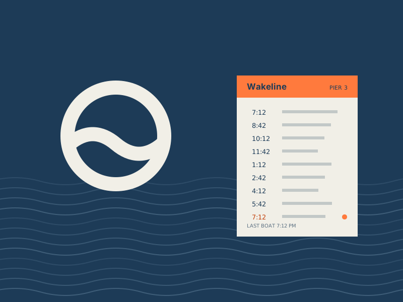
Wakeline runs eleven passenger ferries on Lake Minnetonka. We rebuilt its identity around a single ring-and-wave mark and a schedule system that works on a phone, a pier and a paper fold-out.
- Identity system
- Wayfinding
- Schedule design
- Livery
The challenge
Wakeline had grown out of three older operators, and it showed: four logos, two typefaces on the same pier and schedules that changed format from boat to boat. Tourists missed the last ferry home; regulars ignored the signs altogether. The brief was to make one ferry company out of three, without losing the warmth people felt for the old boats.
Approach
- 01
Audit every touchpoint
We photographed all 23 piers and cataloged 412 signs, tickets and notices. Two thirds carried information that was already out of date.
- 02
One mark, one grid
The ring-and-wave mark reads at a third of an inch on a ticket and at ten feet on a bow. Everything else sits on a single eight-column grid shared by print, signs and screens.
- 03
Schedules first
We designed the departure board before the logo. Times are set large in tabular figures, with the last boat of the day marked in buoy orange.
Results
- Complaints about missing the last ferry, first season
- −38%
- Piers re-signed in one winter shutdown
- 23
- Grid shared by print, signage and the app
- 1
“People tell us the boats feel newer. They are not. They are just easier to understand now.”
Credits
Noemi Imhof, Selin Karaca, Céline Odermatt — for Wakeline, Excelsior, 2025.