A city-bike brand riders want to be seen with.
- Client
- Kite Mobility
- Industry
- Urban mobility
- Services
- Brand identity, app design, launch campaign
- Year
- 2026
- Team
- 9 people, 16 weeks
The challenge
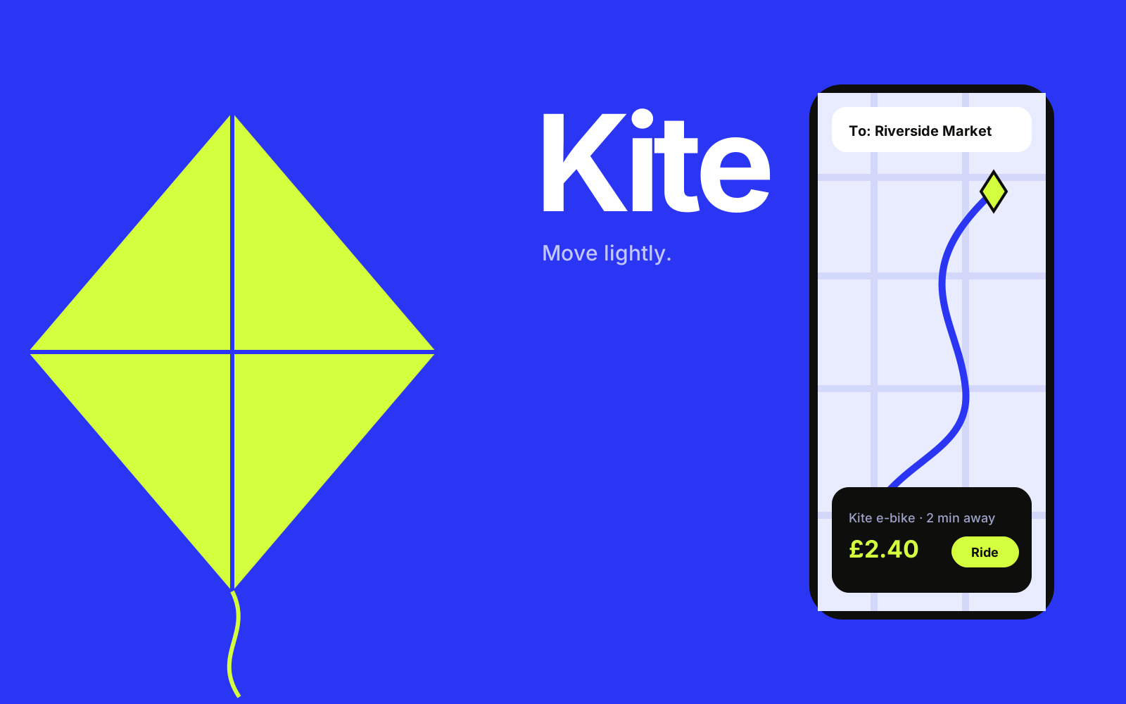
Kite had the biggest e-bike fleet in four cities and the least loved brand. Riders called it “the green bikes”, if they called it anything.
Their app had grown feature by feature for five years. Unlocking a bike took six screens, parking rules changed street by street, and one in five support tickets was someone who couldn’t end their ride.
Ahead of a Series C and expansion into three new cities, Kite asked us for a brand with a point of view, and an app that felt as quick as the bikes themselves.
Before & after
Drag the handle, or use the arrow keys
Our approach
- Step 01
Ride along
We spent two weeks riding with commuters, delivery riders and tourists in three cities, and logged 140 pain points.
- Step 02
A brand that moves
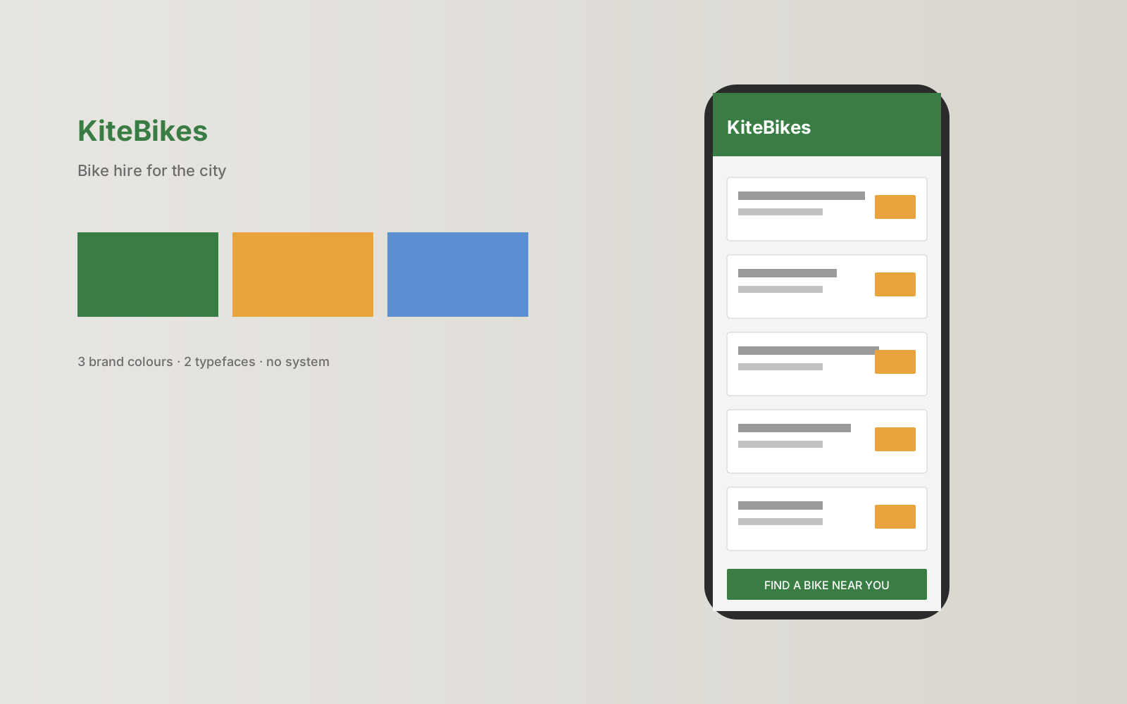
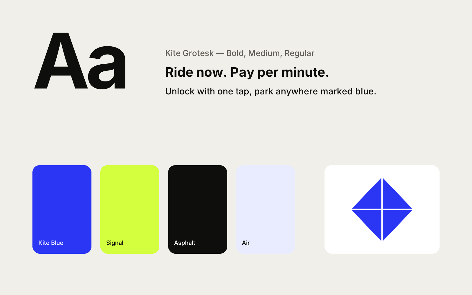
The kite mark is built from the city grid, and its colours come from the signal lights riders look for.
- Step 03
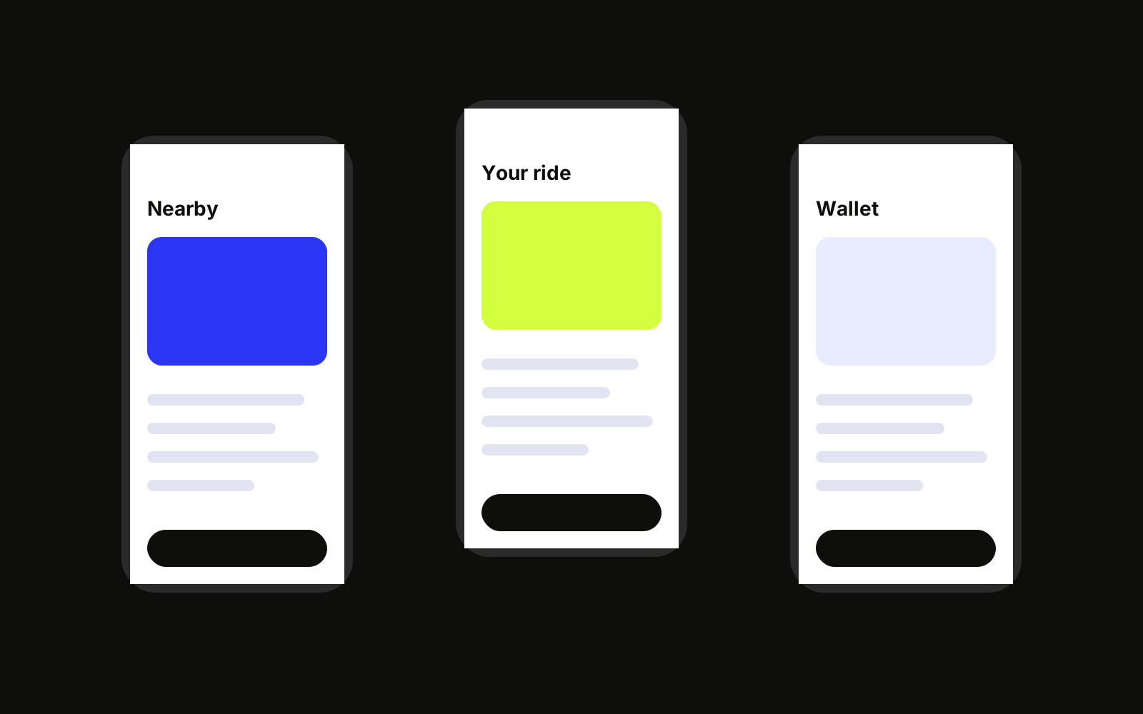
Unlock in one tap
We cut the unlock flow from six screens to one and redesigned parking around clear blue zones.
- Step 04
Launch on the streets
Bikes became the billboard: 2,000 fleet wraps, rider-made content and a launch week with free first rides.
Results
- +64%
- App downloads in the first quarter after launch
- 4.8
- Average App Store rating, up from 3.1
- −38%
- Fewer support tickets about unlocking and parking
- 3
- Design awards, including Gold for Brand Identity
“Riders started posting photos of our bikes. That had never happened before. That’s what a brand with a point of view does.”
 Lena VogelCEO, Kite Mobility
- Creative direction
- Amara Okoye
- Design
- Inês Duarte, Yuki Tanaka
- Strategy
- Hannah Brooks
- Engineering
- Marcus Bell, Dele Adeyemi